-
Architects: Wittfoht Architekten
- Area: 14500 m²
- Year: 2013
-
Photographs:Brigida González
-
Manufacturers: Aprotec, Hussl, Kvadrat, Mafi, Nimbus Group, Zumtobel

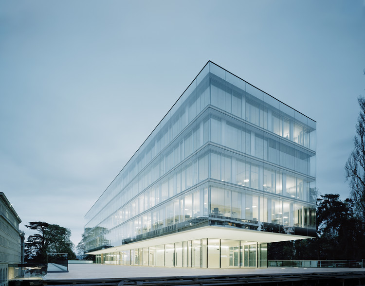
Text description provided by the architects. After winning the international architectural design competition, Stuttgart based wittfoht architekten were commissioned to build the extension of the World Trade Organization headquarters in Geneva. The new administrative building, integrated into the site, creates a feeling of openness and transparency.

Urban planning concept
The site is situated in an unusual location mixing both city and lake surroundings. The lakeside wooden park incorporating the existing group of WTO buildings is a key determining factor in the project. The new building complements and completes the overall urban setting with its existing building ensemble. It responds to the cramped conditions in the southern part of the site while integrating the existing necessary and functional constraints. It maintains a respectful distance from the old buildings and creates a high-quality outdoor area between the two structures. A balanced, well-proportioned overall picture presents itself, which is enriched by a dialogue between old and new.


Architectural concept
The dimensions of the extension are limited to the former car park, meaning the existing trees on the site could remain in place and no additional areas had to be sealed off for construction. Visitors are led from the main gate through the old building, over a spacious footbridge and directly into the main lobby in the extension. From here, all areas of the new building can be accessed. The new building is essentially divided into two sections – the base structure at ground level and the glass structure suspended above. Thanks to this division, the actual dimensions appear smaller and are playfully incorporated into the park area. The building appearance is defined by openness and transparency.


The earth-bound base zone is home to mass catering facilities. The roof of the base structure is designed as an accessible wooden deck, welcoming visitors to use it as a viewing platform. A terrace at the front expands the restaurant towards the lake. The floating, crystalline volume above houses the administration and office areas. The allocation of areas within the building creates spaces for informal meetings and conversations. The office floors offer high flexibly organization. Many office organizations are possible – from classical single offices to combined areas and open-plan workspaces. The façade has a modular design and supports the required flexibility of the building. Dividing walls can be positioned freely within the building plan. All workstations have an ample supply of daylight and pleasant links to the outdoors. The building core and infrastructural facilities are located in the center of the building, thus making it easy for visitors to find their way around. Additional flights of spiral stairs help to promote internal communication between floors.

Product Description.Thanks to the glass structure - designed as a double façade, which also allows for natural ventilation - the actual dimensions of the building appear smaller and are playfully incorporated into the park area.
The idea was to reach the highest levels of transparency and openness through a clear and flexible building design, which creates a bright and timelessly modern appearance.


